文章目录
- 一、qss简介与应用
- 二、QLineEdit qss介绍与使用
- 三、QPushButton qss
- 1.常用qss
- 1.1 基本样式表
- 1.2 背景图片
- 1.3 图片在左文字在右
- 2.点击按钮弹出菜单以及右侧箭头样式设置
- 3.鼠标悬浮按钮弹出对话框
- 四、QCheckBox qss妙用:实时打开关闭状态按钮
- 五、QComboBox样式表介绍
- 六、QProgressBar用法及qss
- 1. 水平样式1
- 2.水平样式2
- 3.竖直样式表
- 4.其它竖直样式--渐变色
- 七、QSlider样式表介绍
- 八、qss加载方式详解
- 九、控件提升
- 十、Qt鼠标相对位置、绝对位置、窗口位置、控件位置、控件大小、控件绝对位置
- 十一、自定义QLineEdit实现搜索编辑框
- 十二、自定义QTabWidget实现tab在左,文本水平
一、qss简介与应用
Qt Style Sheets ,简写是QSS,Qt样式表,用于修改控件外观,美化界面。它类似于前端的CSS(Cascading Style Sheets)但专门用于Qt应用程序。QSS允许开发者通过样式表来控制窗口部件的外观和感觉,而无需修改应用程序的源代码。
qss的简介与应用详细可参考:Qt开发 | qss介绍 | 常用样式 | 控件样式应用 | qss选择器
二、QLineEdit qss介绍与使用
常用属性设置
setReadOnly(false);  // 只读
setFocusPolicy(Qt::NoFocus); // 设置控件的焦点策略:无法获得焦点
setMaxLength(10); // 最多输入10个字符
setEchoMode(QLineEdit::Password); //设置行编辑的回显模式为密码模式-6
=文本对齐方式
lineedit->setAlignment(Qt::AlignLeft)    //左对齐
lineedit->setAlignment(Qt::AlignRight)   //右对齐
lineedit->setAlignment(Qt::AlignCenter)  //居中对齐
正则控制输入。例如:第一个数是1-9的,第二个数和之后的是0-9的
QRegExp regx("\\w[-\\w.+]*@([A-Za-z0-9][-A-Za-z0-9]+\\.)+[A-Za-z]{2,14}");	//邮箱正则
QValidator *validator = new QRegExpValidator(regx, ui->lineEdit);
lineEdit->setValidator(validator);	//设置行编辑值的验证器为正则,满足正则的输入才为有效值
样式设置
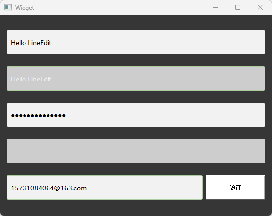
qss代码
QLineEdit{
	border: 1px solid #ABCDA0;      /* 边框宽度为1px,颜色为#A0A0A0 */
	border-radius: 3px;         /* 边框圆角 */
	padding-left: 5px;           /* 文本距离左边界有5px */
	background-color: #F2F2F2;     /* 背景颜色 */
	color: #A0A0A0;     /* 文本颜色 */
	selection-background-color: #A0A0A0;     /* 选中文本的背景颜色 */
	selection-color: #F2F2F2;    /* 选中文本的颜色 */
	font-family: "Microsoft YaHei";    /* 文本字体族 */
	font-size: 10pt;    /* 文本字体大小 */
}

QLineEdit:hover { /* 鼠标悬浮在QLineEdit时的状态 */
	border: 1px solid #298DFF;
	border-radius: 3px;
	background-color: #F2F2F2;
	color: #298DFF;
	selection-background-color: #298DFF;
	selection-color: #F2F2F2;
}

/*0为正常显式,1为ubuntu模式下,2为密码显式,3为ubuntu下的密码显式--看不到输入内容*/
/*与方法setEchoMode(QLineEdit::EchoMode)一起使用*/
QLineEdit[echoMode="2"] { /* QLineEdit有输入掩码时的状态 */
	lineedit-password-character: 9679;
	lineedit-password-mask-delay: 2000;
}

QLineEdit:disabled { /* QLineEdit在禁用时的状态 */
	border: 1px solid #CDCDCD;
	background-color: #CDCDCD;
	color: #B4B4B4;
}

QLineEdit:read-only { /* QLineEdit在只读时的状态 */
	background-color: #CDCDCD;
	color: #F2F2F2;
}
三、QPushButton qss
1.常用qss
1.1 基本样式表
基本样式表示例如下:
QPushButton
{
    /* 前景色, 文字的颜色 */
    color:green;

    /* 背景色 */
    background-color:rgb(223,223,223);

    /* 边框风格 */
    border-style:outset;

    /* 边框宽度 */
    border-width:0.5px;

    /* 边框颜色 */
    border-color:rgb(10,45,110);

    /* 边框倒角 */
    border-radius:10px;

    /* 字体 */
    font:bold 22px;

    /* 控件最小宽度 */
    min-width:100px;

    /* 控件最小高度 */
    min-height:20px;

    /* 内边距 */
    padding:4px;
}

/* 鼠标按下时的效果,这里指定了对象名称 */
QPushButton#pushButton:pressed
{
    /* 改变背景色 */
    background-color:rgb(40,85,20);

    /* 改变边框风格 */
    border-style:inset;

    /* 使文字有一点移动 */
    padding-left:6px;
    padding-top:6px;
}

/* 按钮样式 */
QPushButton:flat
{
    border:2px solid red;
}

/*鼠标悬浮时的效果*/
QPushButton:hover
{
    color:#0000ff;
    background-color:rgb(210, 205, 205); /*改变背景色*/
    border-style:inset;/*改变边框风格*/
    padding-left:8px;
    padding-top:8px;
}
效果图:
悬浮时:
点击时:

还可以单独指定按钮,用#标明例如:
/*鼠标悬浮时的效果*/
QPushButton#btn2:hover
{
    color:#0000ff;
    background-color:rgb(100, 100, 20); /*改变背景色*/
    border-style:inset;/*改变边框风格*/
    padding-left:8px;
    padding-top:8px;
}
相关状态有
:checked      button部件被选中
:unchecked    button部件未被选中
:disabled     部件被禁用
:enabled      部件被启用
:focus        部件获得焦点
:hover        鼠标位于部件上
:pressed      部件被鼠标按下
:indeterminate    checkbox或radiobutton被部分选中
:off              部件可以切换,且处于off状态
:on               部件可以切换,且处于on状态
当按钮被禁用后(ui->pushButton->setEnabled(false);)
QPushButton:disabled
{
	color: blue;
	border-color: brown;
    background-color: #363636;
}
1.2 背景图片
若要添加按钮的背景图片,则使用如下qss代码
QPushButton
{
	background-image:url(":/resources/user.png");
	background-position:center;
	background-repeat: no-repeat;
	border:none
}

QPushButton:hover
{
	background-color:rgb(10,210,210);
	background-image:url(":/resources/user_hover.png")
}

QPushButton:pressed
{
	background-color:rgb(255, 0, 0);
	background-image:url(":/resources/user.png");
	padding-left:8px;
    padding-top:8px;
}
svg 矢量图 :可以随着控件大小而改变,不会失真。做项目时,产品要提供6张图:正常状态、悬浮状态、点击状态(vip/非vip各一套)
效果图:

悬浮时:

点击时:
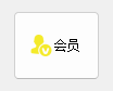
1.3 图片在左文字在右
按钮要实现这种样式,需要利用QWidget类的void setLayoutDirection(Qt::LayoutDirection direction)方法来设置控件布局方向属性。Qt::LayoutDirection 是一个枚举类型,它有两个值:
Qt::LeftToRight:默认值,表示布局方向是从左到右。Qt::RightToLeft:表示布局方向是从右到左
qt代码:
ui->pushButton_3->setText(u8"会员");
ui->pushButton_3->setFixedSize(80, 64);
ui->pushButton_3->setIcon(QIcon(":/resources/vip_yes.png"));
ui->pushButton_3->setLayoutDirection(Qt::LeftToRight);
效果图为:
还可以用样式表实现这样的效果
ui->pushButton_4->setFixedSize(200, 64);
ui->pushButton_4->setText(u8"非会员");
QString btnStyle = "QPushButton{"
    "background-image: url(:/resources/vip_no.png);"
    "background-repeat: no-repeat;"
    "background-origin: padding;"
    "background-position: left;"
    "padding-left:65px;"
    "border: none;"
    "background-color: rgb(0, 255, 255);"
    "color:rgb(0, 0, 0);"
    "text-align:left;"
    "font: bold italic 30px \"Microsoft YaHei\";"
"}";

ui->pushButton_4->setStyleSheet(btnStyle);
注意:若要使用按钮做图片在上文字在下的布局,则
因为QPushButton继承于QWidget,图片在上文字在下的布局就等于两个QLabel的竖直布局
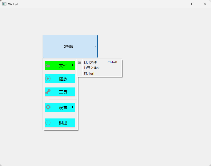
2.点击按钮弹出菜单以及右侧箭头样式设置
-
QPushButton如何设置菜单
调用QPushButton的setMenu方法
void setMenu(QMenu* menu); -
按钮菜单写法
-
错误的写法
在按钮槽函数里写按钮弹出菜单,此时按钮需要点两次才弹出菜单
-
正确的写法
在按钮槽函数外面写,例如构造函数里面写
-
-
如何创建菜单
QMenu(菜单类)添加多个QAction(菜单项)构成菜单。
m_pRightMenu = new QMenu(this); QAction *pAction1 = new QAction("查看"); QAction *pAction2 = new QAction("排序方式"); QAction *pAction3 = new QAction("刷新"); m_pRightMenu->addAction(pAction1); m_pRightMenu->addAction(pAction2); m_pRightMenu->addAction(pAction3); -
如何创建多级菜单
QMenu(菜单类)除了可以添加action构成菜单,QMenu可以添加QMenu构成多级菜单
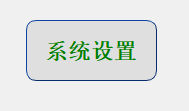
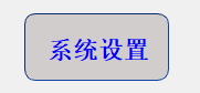
QMenu *setMenuItems = new QMenu; QAction *sysSetAc = new QAction(u8"系统设置", this); QAction *playSetAc = new QAction(u8"播放设置", this); QAction *zimuSetAc = new QAction(u8"字幕设置", this); setList << sysSetAc << playSetAc << zimuSetAc; setMenuItems->addActions(setList); m_pRightMenu->addMenu(setMenuItems); -
菜单action响应
QAction的响应需要链接信号triggered
示例:
widget.h:
#ifndef WIDGET_H
#define WIDGET_H

#include <QWidget>

QT_BEGIN_NAMESPACE
namespace Ui { class Widget; }
QT_END_NAMESPACE

class Widget : public QWidget
{
    Q_OBJECT

public:
    Widget(QWidget *parent = nullptr);
    ~Widget();

private:
    Ui::Widget *ui;
};
#endif // WIDGET_H
widget.cpp:
#include "widget.h"
#include "ui_widget.h"
#include <QMenu>
#include <QAction>
#include <QFileDialog>
#include <string>

using namespace std;

Widget::Widget(QWidget *parent)
    : QWidget(parent)
    , ui(new Ui::Widget)
{
    ui->setupUi(this);

    QMenu *pMenu = new QMenu;  //主菜单
    QMenu *fileMenuItems = new QMenu;

    //菜单添加icon
    fileMenuItems->setIcon(QIcon(":/resources/file.png"));
    fileMenuItems->setTitle(u8"文件");

    QList<QAction*> acList;

    // action添加icon
    QAction *openFileAc = new QAction(QIcon(":/resources/file.png"), u8"打开文件", this);
    //openFileAc->setShortcuts(QKeySequence::Print);       //设置快捷键
    openFileAc->setShortcut(QKeySequence("Ctrl+8"));  //随意指定快捷键
    QAction *openFloderAc = new QAction(u8"打开文件夹", this);

    QAction *openUrlAc = new QAction(u8"打开url", this);

    //多级子菜单项
    acList << openFileAc << openFloderAc << openUrlAc;
    fileMenuItems->addActions(acList);


    pMenu->addMenu(fileMenuItems);

    QAction *play = new QAction(QIcon(":/resources/play.png"), u8"播放", this);
    QAction *tools = new QAction(QIcon(":/resources/tools.png"), u8"工具", this);
    pMenu->addAction(play);
    pMenu->addAction(tools);

    pMenu->addSeparator();

    QMenu *setMenuItems = new QMenu;
    setMenuItems->setTitle(u8"设置");
    setMenuItems->setIcon(QIcon(":/resources/set.png"));
    QList<QAction*> setList;

    QAction *sysSetAc = new QAction(u8"系统设置", this);
    QAction *playSetAc = new QAction(u8"播放设置", this);
    QAction *zimuSetAc = new QAction(u8"字幕设置", this);
    setList << sysSetAc << playSetAc << zimuSetAc;
    setMenuItems->addActions(setList);

    pMenu->addMenu(setMenuItems);

    pMenu->addSeparator();

    QAction *exitAc = new QAction(QIcon(":/resources/exit.png"), u8"退出", this);
    pMenu->addAction(exitAc);

    ui->pushButton->setMenu(pMenu);

    connect(openFileAc, &QAction::triggered, [=]{
        QString fileName = QFileDialog::getOpenFileName(this,
                                                        u8"请选择视频文件",
                                                        "D:/",
                                                        "视频(*.mp4 *.flv);;");

        if(fileName.isEmpty())
        {
            return;
        }
    });

    //R字符串写样式
    string menu_qss = R"(
        QMenu::item
        {
             font:16px;
             background-color:rgb(25,253,253);
             padding:8px 32px;
             margin:8px 8px;
             border-bottom:1px solid #FF0000;   /*底部边界*/
        }

        /*选择项设置*/
        QMenu::item:selected
        {
             background-color: #00FF00;
        }
    )";

    pMenu->setStyleSheet(QString::fromStdString(menu_qss));
}

Widget::~Widget()
{
    delete ui;
}
main.cpp:
#include "widget.h"

#include <QApplication>

int main(int argc, char *argv[])
{
    QApplication a(argc, argv);
    Widget w;
    w.show();
    return a.exec();
}
运行结果:
使用头文件来引入样式修改上述效果图
qss.h:
#ifndef QSS_H
#define QSS_H

#include <string>

using namespace std;

//按钮样式--按钮可展开下拉菜单与不展开时的设置
string button_qss = R"(
    QPushButton
    {
        font:18px "Microsoft YaHei";
        color:rgb(255,255,255);
        border:none
    }
	/*定义 QPushButton 控件在菜单指示器打开状态下的样式*/
    QPushButton::menu-indicator:open
    {
        image:url(:/resources/down_arrow.svg);
        subcontrol-position:right center;	/*定义了下拉菜单指示器在按钮中的位置*/
        subcontrol-origin:padding;border:none; /*定义了子控件(菜单指示器)的定位基准点*/
    }
	/*定义 QPushButton 控件在菜单指示器关闭状态下的样式*/
    QPushButton::menu-indicator:closed
    {
        image:url(:/resources/up_arrow.svg);
        subcontrol-position:right center;
        subcontrol-origin:padding;border:none;
    }
)";

/*菜单样式--*/
string menuQss = R"(
    QMenu
    {
        background-color:rgb(53, 63, 73);
    }

    QMenu::item
    {
         font:16px;
         color:white;
         background-color:rgb(53, 63, 73);
         padding:8px 32px;
         margin:8px 8px;
         /*border-bottom:1px solid #DBDBDB;  item底部颜色*/
    }

    /*选择项设置*/
    QMenu::item:selected
    {
         background-color:rgb(54, 54, 54);
    }
)";

/*菜单子项样式--*/
string menuItemQss = R"(
    QMenu
    {
        background-color:rgb(73, 73, 73);
    }

    QMenu::item
    {
         font:16px;
         color:white;
         background-color:rgb(73, 73, 73);
         padding:8px 32px;
         margin:8px 8px;
         /*border-bottom:1px solid #DBDBDB;  item底部颜色*/
    }

    /*选择项设置*/
    QMenu::item:selected
    {
         background-color:rgb(54, 54, 54);
    }
)";

#endif // QSS_H
widget.cpp:
#include "widget.h"
#include "ui_widget.h"
#include <QMenu>
#include <QAction>
#include <QFileDialog>
#include "qss.h"

Widget::Widget(QWidget *parent)
    : QWidget(parent)
    , ui(new Ui::Widget)
{
    ui->setupUi(this);

    this->setStyleSheet("background-color:rgb(54,54,54)");  //窗体背景色

    QMenu *fileMenuItems = new QMenu;

    //菜单添加icon
    fileMenuItems->setIcon(QIcon(":/resources/file.png"));
    fileMenuItems->setTitle(u8"文件");
    fileMenuItems->setStyleSheet(QString::fromStdString(menuItemQss));

    QList<QAction*> acList;

    // action添加icon
    QAction *openFileAc = new QAction(QIcon(":/resources/file.png"), u8"打开文件", this);
    //openFileAc->setShortcuts(QKeySequence::Print);       //设置快捷键
    openFileAc->setShortcut(QKeySequence("Ctrl+8"));  //随意指定快捷键
    QAction *openFloderAc = new QAction(u8"打开文件夹", this);

    QAction *openUrlAc = new QAction(u8"打开url", this);

    //多级子菜单项
    acList << openFileAc << openFloderAc << openUrlAc;
    fileMenuItems->addActions(acList);

    QMenu *pMenu = new QMenu;  //主菜单
    pMenu->addMenu(fileMenuItems);

    QAction *play = new QAction(QIcon(":/resources/play.png"), u8"播放", this);
    QAction *tools = new QAction(QIcon(":/resources/tools.png"), u8"工具", this);
    pMenu->addAction(play);
    pMenu->addAction(tools);

    pMenu->addSeparator();

    QMenu *setMenuItems = new QMenu;
    setMenuItems->setTitle(u8"设置");
    setMenuItems->setIcon(QIcon(":/resources/set.png"));
    QList<QAction*> setList;

    QAction *sysSetAc = new QAction(u8"系统设置", this);
    QAction *playSetAc = new QAction(u8"播放设置", this);
    QAction *zimuSetAc = new QAction(u8"字幕设置", this);
    setList << sysSetAc << playSetAc << zimuSetAc;
    setMenuItems->addActions(setList);
    setMenuItems->setStyleSheet(QString::fromStdString(menuItemQss));
    pMenu->addMenu(setMenuItems);

    pMenu->addSeparator();

    QAction *exitAc = new QAction(QIcon(":/resources/exit.png"), u8"退出", this);
    pMenu->addAction(exitAc);

    ui->pushButton->setMenu(pMenu); //设置菜单

    connect(openFileAc, &QAction::triggered, [=]{
        QString fileName = QFileDialog::getOpenFileName(this,
                                                        u8"请选择视频文件",
                                                        "D:/",
                                                        "视频(*.mp4 *.flv);;");

        if(fileName.isEmpty())
        {
            return;
        }
    });

    ui->pushButton->setText(u8"QW影音");
    ui->pushButton->setFixedSize(100, 32);
    ui->pushButton->setStyleSheet(QString::fromStdString(button_qss));
    pMenu->setStyleSheet(QString::fromStdString(menuQss));
}

Widget::~Widget()
{
    delete ui;
}
运行结果:
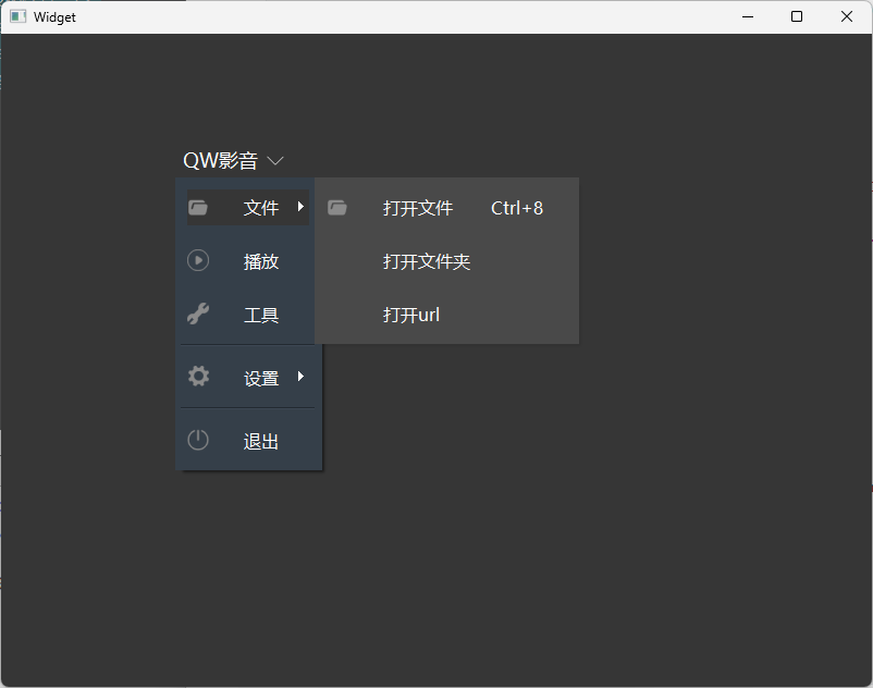
注意:菜单弹出的位置也可以控制
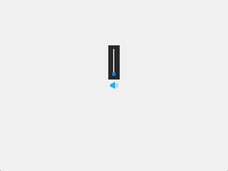
3.鼠标悬浮按钮弹出对话框
要实现鼠标悬浮按钮弹出对话框,需要利用两个事件:鼠标进入、离开事件
-
鼠标进入控件或窗口
void enterEvent(QEvent* event) override; -
鼠标离开控件或窗口
void leaveEvent(QEvent* event) override;
示例:
CVolumeSliderDialog.h:新建音量滑动条对话窗口
#ifndef CVOLUMESLIDERDIALOG_H
#define CVOLUMESLIDERDIALOG_H

#include <QDialog>
#include <QSlider>

class CVolumeSliderDialog : public QDialog
{
	Q_OBJECT

public:
	CVolumeSliderDialog(QWidget *parent = Q_NULLPTR);
	~CVolumeSliderDialog();

	void setSliderValue(int value)
	{
		m_pSlider->setValue(value);
	}

protected:
	bool event(QEvent* event) override;

signals:
	void sig_SliderValueChanged(int value);

private:
	QSlider* m_pSlider = nullptr;
};

#endif
CVolumeSliderDialog.cpp:
#include "CVolumeSliderDialog.h"
#include <QVBoxLayout>
#include <QEvent>
#include <windows.h>


//注意由于此类使用了windows的函数SetClassLong,需要包含user32.lib
//如果是在vs2019中使用则不需要包含user32.lib
#pragma comment(lib, "user32.lib")

CVolumeSliderDialog::CVolumeSliderDialog(QWidget* parent)
	: QDialog(parent)
{
	this->setFixedSize(40, 200);
	QVBoxLayout* pVLay = new QVBoxLayout(this);
	m_pSlider = new QSlider(this);
	m_pSlider->setOrientation(Qt::Vertical);
	pVLay->addWidget(m_pSlider);

	setFixedSize(40, 120);
    setWindowFlags(Qt::FramelessWindowHint | Qt::ToolTip);   //ToolTip = Popup | Sheet : 悬浮是显示,离开时消失
    setStyleSheet("QDialog{background-color: rgba(54, 54, 54, 0.5);}");  //0.5表示透明度,0表示全透明、1表示不透明;也可以使用百分百表示如: frm->setStyleSheet(“QFrame{background-color: rgba(255, 0, 0, 50%);}”);

	connect(m_pSlider, &QSlider::valueChanged, [=](int value) {
		emit sig_SliderValueChanged(value);
		});
}

CVolumeSliderDialog::~CVolumeSliderDialog()
{
}

//参考qt文档:bool QWidget::event(QEvent *event)
//设置popup后,dialog有窗口阴影,需要去除就重写event函数
bool CVolumeSliderDialog::event(QEvent* event)
{
    static bool class_amended = false;

    if (event->type() == QEvent::WinIdChange)
    {
        HWND hwnd = (HWND)winId();

        if (class_amended == false)
        {
            class_amended = true;
            DWORD class_style = ::GetClassLong(hwnd, GCL_STYLE);
            class_style &= ~CS_DROPSHADOW;
            ::SetClassLong(hwnd, GCL_STYLE, class_style); // windows系统函数
        }
    }

	return QWidget::event(event);
}
CVolumeButton.h:当鼠标进入音量按钮时,显示音量滑动条
/*
音量调节按钮
功能:
	1. 鼠标悬浮到音量时显示slider dialog
	2. 点击时mute
注意问题:
	重写按钮类,样式表无效
*/

#pragma once

#include <QPushButton>
#include "CVolumeSliderDialog.h"


class CVolumeButton : public QPushButton
{
	Q_OBJECT

public:
    CVolumeButton(QWidget* parent = nullptr);
	~CVolumeButton();

	bool getMute() const
	{
		return m_isMute;
	}

	void setMute(bool mute) { m_isMute = mute; }

signals:
	void sig_VolumeValue(int value);

protected:
	void paintEvent(QPaintEvent* event) override;
	void enterEvent(QEvent* event) override;
	//void leaveEvent(QEvent* event) override;
	void mousePressEvent(QMouseEvent* event) override;
	void timerEvent(QTimerEvent* event) override;

private:
	bool m_isMute = false;  //是否静音
	CVolumeSliderDialog* m_pVolumeSliderDlg = nullptr;

    int m_timerId = -1;
};
CVolumeButton.cpp:
#include "CVolumeButton.h"
#include <QMouseEvent>
#include <QStylePainter>
#include <QStyleOptionButton>
#include <iostream>
#include <QDebug>
#include <QThread>

using namespace std;

CVolumeButton::CVolumeButton(QWidget* parent)
	: QPushButton(parent)
{
    this->setFixedSize(32,32);

    setStyleSheet("QPushButton{background-image:url(:/resources/audio_open.svg);border:none;}"
        "QPushButton:hover{background-image:url(:/resources/audio_open_hover.svg);border:none;}"
        "QPushButton:pressed{background-image:url(:/resources/audio_open.svg);border:none;}");
}

CVolumeButton::~CVolumeButton()
{
}

//重写控件绘制的事件
void CVolumeButton::paintEvent(QPaintEvent*)
{
    QStylePainter p(this);  //与CVolumeButton对象(即this指针指向的对象)关联
	QStyleOptionButton option;
    initStyleOption(&option); //将当前控件的相关信息填充到option对象中
    p.drawControl(QStyle::CE_PushButton, option);   //使用QStylePainter对象p来绘制一个按钮控件。
                                                    //QStyle::CE_PushButton是一个枚举值,表示要绘制的控件类型是按钮。option对象包含了绘制按钮所需的所有选项和状态信息。
}

//重写鼠标进入控件的事件,移动音量滑动条控件
void CVolumeButton::enterEvent(QEvent* event)
{
	if (!m_pVolumeSliderDlg)
        m_pVolumeSliderDlg = new CVolumeSliderDialog(this);
    //将控件的局部坐标转化成全局屏幕坐标,返回控件左上角像素点的全局屏幕坐标
	QPoint p1 = this->mapToGlobal(QPoint(0, 0));  //声音按钮左上角相对于桌面的绝对位置
    // qDebug() << p1.x() << "    " << p1.y();
    QRect rect1 = this->rect(); //控件内部集合形状
	QRect rect2 = m_pVolumeSliderDlg->rect();     //rect包含标题栏,去掉标题栏后height不变

	int x = p1.x() + (rect1.width() - rect2.width()) / 2;
	int y = p1.y() - rect2.height() - 5;
	m_pVolumeSliderDlg->move(x, y);   //move是相对于桌面原点的位置

	m_pVolumeSliderDlg->show();

    //启动定时器返回计时器标识符
    //当计时器事件发生时,会调用timerEvent()虚函数,并将QTimerEvent事件参数类传递给它。
    m_timerId = startTimer(250);

	connect(m_pVolumeSliderDlg, &CVolumeSliderDialog::sig_SliderValueChanged, [=](int value) {
		emit sig_VolumeValue(value);
		});
}


//void CVolumeButton::leaveEvent(QEvent* event)
//{
//	根据鼠标的位置判断音量调节窗口是否消失
//	//QPoint p1 = QCursor::pos();   //绝对位置
//
//	//cout << "QCursor x= " << p1.x() << " y = " << p1.y() << endl;
//
//	//if (m_pVolumeSliderDlg)
//	//{
//	//	QRect rect1 = this->rect();  //按钮矩形
//	//	QRect rect2 = m_pVolumeSliderDlg->rect();
//	//	QRect rect3 = m_pVolumeSliderDlg->geometry();
//
//	//	QPoint p2 = this->mapToGlobal(QPoint(0, 0));   //声音按钮左上角相对于桌面的绝对位置
//
//	//	//已知:音量框宽40 > 按钮宽30
//	//	QRect area(rect3.left(), rect3.top(), rect2.width(), p2.y() + rect1.height() - rect3.top()); //左上宽高
//
//	//	cout << "p1 x = " << p1.x() << " y = " << p1.y() << endl;
//
//	//	if (!area.contains(p1))
//	//	{
//	//		m_pVolumeSliderDlg->hide();
//	//	}
//	//}
//}

//重写鼠标按下事件;音量在静音与正常状态之间切换
void CVolumeButton::mousePressEvent(QMouseEvent* event)
{
	if (event->button() == Qt::LeftButton)
	{
		m_isMute = !m_isMute;
		if (m_isMute)
		{
			if (m_pVolumeSliderDlg)
				m_pVolumeSliderDlg->setSliderValue(0);
		}
		else
		{
			if (m_pVolumeSliderDlg)
				m_pVolumeSliderDlg->setSliderValue(50);
		}
	}
}


/**
 * @brief 用定时器模拟leaveEvent,
 * 直接在leaveEvent里让m_pVolumeSliderDlg消失,效果不太好,
 * 用鼠标移动事件也不太好,定时器是比较好的做法
 */
void CVolumeButton::timerEvent(QTimerEvent* event)
{
	if ((m_pVolumeSliderDlg != nullptr) && (m_pVolumeSliderDlg->isVisible()))
	{
        //判断鼠标的位置与有效区域的关系,若不在有效区域则隐藏音量滑动条
		QPoint p1 = QCursor::pos();   //鼠标绝对位置
		if (m_pVolumeSliderDlg)
		{
			QRect rect1 = this->rect();  //按钮矩形
            QRect rect2 = m_pVolumeSliderDlg->rect();       //获取控件的内部尺寸
            QRect rect3 = m_pVolumeSliderDlg->geometry();  //获取窗口整体大小和位置

			QPoint p2 = this->mapToGlobal(QPoint(0, 0));   //声音按钮左上角相对于桌面的绝对位置

			//已知:音量框宽40 > 按钮宽30
            //QRect:矩形区域,矩形由其左上角的坐标(x, y)、宽度和高度定义。
			QRect area(rect3.left(), rect3.top(), rect2.width(), p2.y() + rect1.height() - rect3.top()); //左上宽高

			if (!area.contains(p1))
			{
				m_pVolumeSliderDlg->hide();
			}
		}
	}
	else
	{
        killTimer(event->timerId());   //直到调用killTimer()函数,计时器事件会每隔interval毫秒发生一次
	}
}
widget.h:
#ifndef WIDGET_H
#define WIDGET_H

#include <QWidget>

QT_BEGIN_NAMESPACE
namespace Ui { class Widget; }
QT_END_NAMESPACE

class Widget : public QWidget
{
    Q_OBJECT

public:
    Widget(QWidget *parent = nullptr);
    ~Widget();

private:
    Ui::Widget *ui;
};
#endif // WIDGET_H
widget.cpp:
#include "widget.h"
#include "ui_widget.h"
#include <QHBoxLayout>
#include "CVolumeButton.h"

Widget::Widget(QWidget *parent)
    : QWidget(parent)
    , ui(new Ui::Widget)
{
    ui->setupUi(this);

    resize(800, 600);

    QHBoxLayout *pHlay = new QHBoxLayout(this);

    CVolumeButton* pVolumeButton = new CVolumeButton(this);
    pHlay->addWidget(pVolumeButton);
}

Widget::~Widget()
{
    delete ui;
}
main.cpp:
#include "widget.h"

#include <QApplication>

int main(int argc, char *argv[])
{
    QApplication a(argc, argv);
    Widget w;
    w.show();
    return a.exec();
}
运行结果:
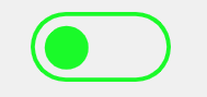
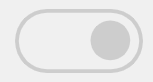
四、QCheckBox qss妙用:实时打开关闭状态按钮
使用QCheckBox 实现实时打开关闭状态按钮的效果,思路是:使用QCheckBox,点击按钮时切换背景图片。
示例:
widget.h:
#ifndef WIDGET_H
#define WIDGET_H

#include <QWidget>

QT_BEGIN_NAMESPACE
namespace Ui { class Widget; }
QT_END_NAMESPACE

class Widget : public QWidget
{
    Q_OBJECT

public:
    Widget(QWidget *parent = nullptr);
    ~Widget();

private:
    Ui::Widget *ui;
};
#endif // WIDGET_H
widget.cpp:
#include "widget.h"
#include "ui_widget.h"
#include <QDebug>

Widget::Widget(QWidget *parent)
    : QWidget(parent)
    , ui(new Ui::Widget)
{
    ui->setupUi(this);

    ui->checkBox->setFixedSize(128, 64);
    //样式表基于指示器的勾选状态进行切换
    QString qss = "QCheckBox::indicator:unchecked{ \
        image:url(:/resources/status_close.png); \
        } \
        QCheckBox::indicator:checked { \
        image: url(:/resources/status_open.png); \
        }";

    ui->checkBox->setStyleSheet(qss);
    ui->checkBox->setChecked(true); // 设置组框为勾选状态
    //ui->checkBox->setTristate(true);  //开启三态

    //当勾选状态改变时,QCheckBox 会发出 clicked(bool) 和 stateChanged(int) 信号。
    connect(ui->checkBox, &QCheckBox::stateChanged , [=](int state){
        qDebug() << state;
    });
}

Widget::~Widget()
{
    delete ui;
}
main.cpp:
#include "widget.h"

#include <QApplication>

int main(int argc, char *argv[])
{
    QApplication a(argc, argv);
    Widget w;
    w.show();
    return a.exec();
}
运行效果:
五、QComboBox样式表介绍
QComboBox样式需要注意的点如下:
-
qss设置item项的高度
除了使用qss代码外,还要使用C++代码控制
qss代码:
/* 下拉后,整个下拉窗体每项的样式 */
/* 项的高度(设置pComboBox->setView(new QListView(this));后该项才起作用) */
QComboBox QAbstractItemView::item
{
    height: 50px;
}
qt代码:
ui->comboBox->setView(new QListView(this)); -
右侧下拉框样式
/* 下拉框样式 */
QComboBox::drop-down
{
    subcontrol-origin: padding;   /* 子控件在父元素中的原点矩形。如果未指定此属性,则默认为padding。 */
    subcontrol-position: top right;   /* 下拉框的位置(右上) */
    width: 32px;   /* 下拉框的宽度 */

    border-left-width: 1px;   /* 下拉框的左边界线宽度 */
    border-left-color: darkgray;   /* 下拉框的左边界线颜色 */
    border-left-style: solid;   /* 下拉框的左边界线为实线 */
    border-top-right-radius: 3px;   /* 下拉框的右上边界线的圆角半径(应和整个QComboBox右上边界线的圆角半径一致) */
    border-bottom-right-radius: 3px;   /* 同上 */
    image: url(:/resources/down.png);
}
注意:image才是箭头的样式,不是background-image
-
右侧下拉箭头样式
/* 下拉箭头样式 */ QComboBox::down-arrow { width: 32px; /* 下拉箭头的宽度(建议与下拉框drop-down的宽度一致) */ background: rgb(54,54,54); /* 下拉箭头的的背景色 */ padding: 0px 0px 0px 0px; /* 上内边距、右内边距、下内边距、左内边距 */ image: url(:/resources/down.png); } -
QComboBox的编辑模式
QComboBox默认是非编辑模式,调用setEditable即可设为编辑模式。
ui->comboBox->setEditable(true);在编辑模式下,输入值按回车,即可将值添加到ComboBox中,默认添加到最后
-
QComboBox自定义排序
在后续的模型代理视图中继续
示例:
样式1:
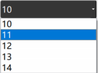
qss代码为:
/* 未下拉时,QComboBox的样式 */
QComboBox
{
    background:rgb(54,54,54);
    border: 1px solid gray;   /* 边框 */
    border-radius: 5px;   /* 圆角 */
    padding: 1px 18px 1px 3px;   /* 字体填衬 */
    color: white;
    font: normal normal 24px "Microsoft YaHei";
}
样式2:
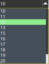
qss代码为
/* 未下拉时,QComboBox的样式 */
QComboBox
{
    border: 1px solid gray;   /* 边框 */
    border-radius: 5px;   /* 圆角 */
    padding: 1px 18px 1px 3px;   /* 字体填衬 */
    color: white;
    font: normal normal 24px "Microsoft YaHei";
    background:rgb(54,54,54);
}

/* 下拉后,整个下拉窗体样式 */
QComboBox QAbstractItemView
{
    outline: 0px solid gray;   /* 选定项的虚框 */
    border: 1px solid yellow;   /* 整个下拉窗体的边框 */
    color: rgb(250,251,252);
    background-color: rgb(70,80,90);   /* 整个下拉窗体的背景色 */
    selection-background-color: lightgreen;   /* 整个下拉窗体被选中项的背景色 */
}

/* 下拉后,整个下拉窗体每项的样式 */
/* 项的高度(设置pComboBox->setView(new QListView(this));后该项才起作用) */
QComboBox QAbstractItemView::item
{
    height: 50px;
}

/* 下拉后,整个下拉窗体越过每项的样式 */
QComboBox QAbstractItemView::item:hover
{
    color: rgb(90,100,105);
    background-color: lightgreen;   /* 整个下拉窗体越过每项的背景色 */
}

/* 下拉后,整个下拉窗体被选择的每项的样式 */
QComboBox QAbstractItemView::item:selected
{
    color: rgb(12, 23, 34);
    background-color: lightgreen;
}

/* QComboBox中的垂直滚动条 */
QComboBox QAbstractScrollArea QScrollBar:vertical
{
    width: 13px;
    background-color: #d0d2d4;   /* 空白区域的背景色*/
}

QComboBox QAbstractScrollArea QScrollBar::handle:vertical
{
    border-radius: 5px;   /* 圆角 */
    background: rgb(60,60,60);   /* 小方块的背景色深灰lightblue */
}

QComboBox QAbstractScrollArea QScrollBar::handle:vertical:hover
{
    background: rgb(90, 91, 93);   /* 越过小方块的背景色yellow */
}

/* 设置为可编辑(setEditable(true))editable时,编辑区域的样式 */
QComboBox:editable
{
    background: green;
}

/* 设置为非编辑(setEditable(false))!editable时,整个QComboBox的样式 */
QComboBox:!editable
{
     background: rgb(54,54,54);
}

/* 设置为可编辑editable时,点击整个QComboBox的样式 */
QComboBox:editable:on
{
    background: rgb(54,54,54);
}

/* 设置为非编辑!editable时,点击整个QComboBox的样式 */
QComboBox:!editable:on
{
     background: rgb(54,54,54);
}

/* 设置为可编辑editable时,下拉框的样式 */
QComboBox::drop-down:editable
{
    background: rgb(54,54,54);
}

/* 设置为可编辑editable时,点击下拉框的样式 */
QComboBox::drop-down:editable:on
{
    background: rgb(54,54,54);
}

/* 设置为非编辑!editable时,下拉框的样式 */
QComboBox::drop-down:!editable
{
    background: rgb(54,54,54);
}

/* 设置为非编辑!editable时,点击下拉框的样式 */
QComboBox::drop-down:!editable:on
{
    background: rgb(54,54,54);
    image: url(:/resources/up.png); /* 显示上拉箭头 */
}

/* 下拉框样式 */
QComboBox::drop-down
{
    subcontrol-origin: padding;   /* 子控件在父元素中的原点矩形。如果未指定此属性,则默认为padding。 */
    subcontrol-position: top right;   /* 下拉框的位置(右上) */
    width: 32px;   /* 下拉框的宽度 */

    border-left-width: 1px;   /* 下拉框的左边界线宽度 */
    border-left-color: darkgray;   /* 下拉框的左边界线颜色 */
    border-left-style: solid;   /* 下拉框的左边界线为实线 */
    border-top-right-radius: 3px;   /* 下拉框的右上边界线的圆角半径(应和整个QComboBox右上边界线的圆角半径一致) */
    border-bottom-right-radius: 3px;   /* 同上 */
    image: url(:/resources/down.png);
}

/* 越过下拉框样式 */
QComboBox::drop-down:hover
{
    background: rgb(80, 75, 90);
}

/* 下拉箭头样式 */
QComboBox::down-arrow
{
    width: 32px; /* 下拉箭头的宽度(建议与下拉框drop-down的宽度一致) */
    background: rgb(54,54,54); /* 下拉箭头的的背景色 */
    padding: 0px 0px 0px 0px; /* 上内边距、右内边距、下内边距、左内边距 */
    image: url(:/resources/down.png);
}

/* 点击下拉箭头 */
QComboBox::down-arrow:on
{
    image: url(:/resources/up.png); /* 显示上拉箭头 */
}
六、QProgressBar用法及qss
QProgressBar 是 Qt 框架中的进度条控件,用于显示任务的进度。通常用来表示加载数据、文件传输或其他需要时间的任务的进度。
1. 水平样式1
QProgressBar默认是水平效果。
qss代码:
QProgressBar
{
      background:rgb(54,54,54);
      border:none;   /*无边框*/
      border-radius:5px;
      text-align:center;   /*文本的位置*/
      color: rgb(229, 229, 229);  /*文本颜色*/
}

/*chunk表示里面的进度条*/
QProgressBar::chunk
{
      background-color:rgb(58, 154, 255);
      border-radius:4px;
}
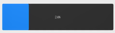
2.水平样式2
效果图:

qss代码
QProgressBar
{
	border-radius:5px;
	background-color:darkgray;
	text-align:center
}

QProgressBar::chunk
{
	background-color:#1F0FEF;
	width:6px;
	margin:5px;	/*相邻进度间距离为5*/
}
3.竖直样式表
C++设置:
ui->progressBar_2->setOrientation(Qt::Vertical);
ui->progressBar_2->setFixedWidth(60);
ui->progressBar_2->setFixedHeight(300);
例如下面的效果
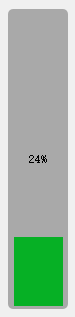
qss代码
QProgressBar:vertical
{
	border-radius:5px;
	background-color:darkgray;
	text-align:center;
	padding-left: 5px; padding-right: 4px; padding-bottom: 2px;
}

QProgressBar::chunk:vertical
{
	background-color:#06B025;
	margin:1px;
}
4.其它竖直样式–渐变色
渐变色
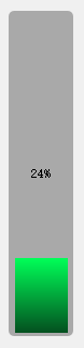
qss代码
QProgressBar:vertical
{
	border-radius:5px;
	background-color:darkgray;
	text-align:center;
	padding-left: 5px; padding-right: 4px; padding-bottom: 2px;
}

QProgressBar::chunk:vertical
{
    /*QLinearGradient表示使用渐变色*/
	background-color:QLinearGradient( x1: 0, y1: 0, x2: 0, y2: 1,stop: 0 #00ff58,stop: 1 #034f1f);
	margin:1px;
}
七、QSlider样式表介绍
滑块经常用到,如:声音调节、视频进度调节等,有水平与竖直两种。
效果图:
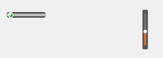
水平的QSlider的qss:
QSlider
{
    background-color: #363636;
	border-style: outset;
	border-radius: 10px;
}
/*凹槽的样式*/
QSlider::groove:horizontal
{
	height: 12px;
	background: qlineargradient(x1:0, y1:0, x2:0, y2:1, stop:0 #B1B1B1, stop:1 #c4c4c4);
	margin: 2px 0
}

/*柄的样式*/
QSlider::handle:horizontal
{
	background: QRadialGradient(cx:0, cy:0, radius: 1, fx:0.5, fy:0.5, stop:0 white, stop:1 green);
	width: 16px;
	height: 16px;
	margin: -5px 6px -5px 6px;
	border-radius:11px;
	border: 3px solid #ffffff;
}
竖直的QSlider的qss:
QSlider
{
	background-color: rgba(22, 22, 22, 0.7);
	padding-top: 15px;  /*上面端点离顶部的距离*/
	padding-bottom: 15px;
	border-radius: 5px; /*外边框矩形倒角*/
}

QSlider::add-page:vertical
{
	background-color: #FF7826;
	width:5px;
	border-radius: 2px;
}

QSlider::sub-page:vertical
{
	background-color: #7A7B79;
	width:5px;
	border-radius: 2px;
}

QSlider::groove:vertical
{
	background:transparent;
	width:6px;
}

QSlider::handle:vertical
{
	height: 14px;
	width: 14px;
	margin: 0px -4px 0px -4px;
	border-radius: 7px;
	background: white;
}